OPEN DOOR CHURCH BRANDING & STYLE GUIDE
Welcome to the Open Door Church style guide. This guide is designed to help maintain consistency in all communications materials and ensure that our visual identity is accurately represented. We believe that a consistent and well-designed brand helps communicate our message more effectively. In this guide, you will find detailed information on our logo, color palette, typography, and imagery. By adhering to these guidelines, we can create a cohesive and professional image that reinforces our mission and values.
COLOR PALETTE
As an integral part of Open Door's brand identity, the colors used in our marketing and design materials must reflect the essence of our church. The lush aqua and brigadier blue are our primary colors, which represent our values of faith, hope, and love. These colors are to be used in all Open Door branding and marketing materials. While white and black can be used as supporting colors in the Open Door branding, they should be used in moderation to maintain consistency and clarity. Additionally, we encourage the use of other complementary colors that are not listed here to add variety and creativity to the designs while still remaining true to the Open Door brand. It is important to follow the Open Door brand guidelines to ensure that all designs reflect our church's identity, message, and mission.


TYPOGRAPHY
Futura is a geometric sans-serif typeface that has been widely used in various design applications, including print, web, and branding. Designed in 1927 by Paul Renner, the font features clean, simple lines and a modernist, timeless look. Futura is an excellent choice for titles, headings, and body text, as it is highly legible and has excellent readability. It comes in several weights and styles, from light to bold and condensed to extended, providing flexibility in design choices. When using Futura, it is essential to consider spacing and alignment, as its geometric shapes can create visual imbalances if not used carefully. The Open Door Church style guide recommends using Futura for its modern, clean, and versatile design, creating a cohesive and professional look across all communication materials.
For print applications, body text should be Futura PT Book at a point size of 9 to 12. Paragraph point size should stay consistent throughout an entire document. Use the styles below as a guide for titles and sub-headers.
FUTURA
The five boxing wizards jump quickly
Aa Bb Cc
The five boxing wizards jump quickly
Aa Bb Cc
The five boxing wizards jump quickly
Aa Bb Cc
CAPTIONS
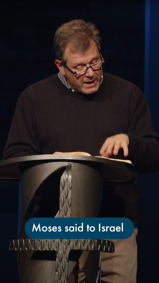
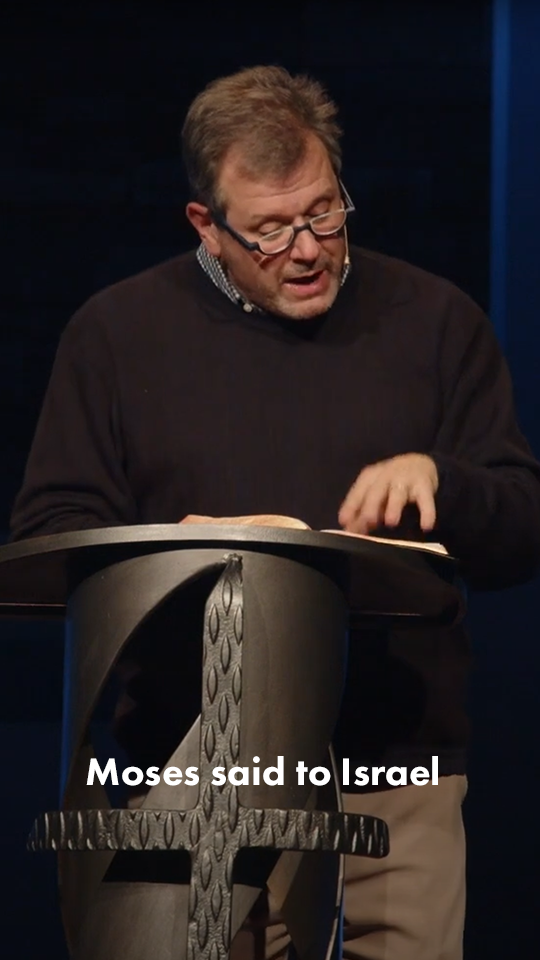
Captions play an important role in creating a cohesive and effective visual message, especially as short-form content continues to grow in prominence. When using captions for Open Door, adhere to the following rules:
- Use one of the styles provided left.
- Only one line of text per caption.
- No more than 7 words per line.
Other styles may be used for sermon series, campaigns, or specific ministries, but must adhere to the one line & no more than 7 words rules.
LOGO
The Open Door logo features a circle with a circular stroke surrounding it. The circle symbolizes the unity and completeness of the church community, while the stroke represents the protection and support offered by the church. The logo is designed to be simple, clean, and easily recognizable, with the use of bold typography and minimalistic design. To ensure consistency and clarity, please adhere to the following guidelines when using the Open Door logo:
- Maintain ample space around the logo so it is not cluttered
- Always maintain the correct proportions of the logo
- Never stretch, distort, or alter the logo in any way.
- Use the full color logo when it is the focal point of a design
- Use a solid color logo when it is not the focal point

PHOTO USAGE
- Choose photos that align with our brand values: When selecting photos for Open Door Church, keep in mind that they should align with our brand values of community, knowledge, and authenticity. Photos should be inviting and represent the diversity of our church community.
- Use high-quality photos: All photos used should be of high quality and resolution. Blurry or pixelated photos are not acceptable.
- Avoid clichés: Avoid using clichéd or stereotypical images. Instead, strive for unique and creative photos that accurately represent our church community.
- Use appropriate filters and effects: When editing photos, use appropriate filters and effects to enhance the quality of the image. However, be careful not to alter the image in a way that distorts or misrepresents reality.
- Stay consistent: To maintain consistency in our brand, use a similar style of photography throughout all materials, including our website, social media, and print materials.
-
![]() See what's happening this month at Open Door!Button
See what's happening this month at Open Door!Button -
![]() Our annual Lottie Moon Christmas Banquet is coming up on Wednesday, December 4th. Please sign up on our website and invite a friend as we come together to support and raise funds for our overseas missionaries. We'll see you there!Button
Our annual Lottie Moon Christmas Banquet is coming up on Wednesday, December 4th. Please sign up on our website and invite a friend as we come together to support and raise funds for our overseas missionaries. We'll see you there!Button -
![]() Each year, we organize a giving opportunity called Bumper Crop, where we gather bags of Thanksgiving food for our food pantry ministry. Please pick up an empty bag with instructions this Sunday after the service and return it filled next week. Thank you for your generosity in supporting those in need!Button
Each year, we organize a giving opportunity called Bumper Crop, where we gather bags of Thanksgiving food for our food pantry ministry. Please pick up an empty bag with instructions this Sunday after the service and return it filled next week. Thank you for your generosity in supporting those in need!Button -
![]() Every year, we set aside a dedicated Sunday morning for a service centered around the theme of a Whole Life Ethic. Join us at 9:15 AM or 11 AM for this important time of worship.Button
Every year, we set aside a dedicated Sunday morning for a service centered around the theme of a Whole Life Ethic. Join us at 9:15 AM or 11 AM for this important time of worship.Button -
![]() Men's Workday is this Saturday! Join us at 8:30 AM to help landscape and maintain our church grounds. It’s a great opportunity to serve and build friendships. Please bring anything useful, like wheelbarrows or pitchforks.Button
Men's Workday is this Saturday! Join us at 8:30 AM to help landscape and maintain our church grounds. It’s a great opportunity to serve and build friendships. Please bring anything useful, like wheelbarrows or pitchforks.Button -
![]() See what's happening this month at Open Door!Button
See what's happening this month at Open Door!Button -
![]() Party on the Block is the Saturday! Invite a friend and join us from 2-4 PM for a fun-filled fall festival with food, games, and trunk-or-treat.Button
Party on the Block is the Saturday! Invite a friend and join us from 2-4 PM for a fun-filled fall festival with food, games, and trunk-or-treat.Button -
![]()
-
![]() Mark your calendars for our annual Christmas Banquet! We aim to raise $25,000 for the Lottie Moon Christmas offering and make a global impact on international missions. Enjoy a delicious meal, live music, carol singing, games, and more! Your generosity matters and helps make His Gospel known. Save the date and celebrate the season with us!Button
Mark your calendars for our annual Christmas Banquet! We aim to raise $25,000 for the Lottie Moon Christmas offering and make a global impact on international missions. Enjoy a delicious meal, live music, carol singing, games, and more! Your generosity matters and helps make His Gospel known. Save the date and celebrate the season with us!Button -
![]() Join us this Friday and Saturday for our Weekend Workshop: Christianity & Politics.Button
Join us this Friday and Saturday for our Weekend Workshop: Christianity & Politics.Button -
![]() See what's happening this month at Open Door!Button
See what's happening this month at Open Door!Button -
![]() Party on the Block is a month away! Join us on October 26th for lawn games, hayrides, food trucks, and the return of a walk-through trunk-or-treat. Remember to invite your neighbors and friends!Button
Party on the Block is a month away! Join us on October 26th for lawn games, hayrides, food trucks, and the return of a walk-through trunk-or-treat. Remember to invite your neighbors and friends!Button -
![]() Reflecting on a great evening last week as the men of Open Door gathered to pray, worship, and enjoy time together. We were encouraged in our time in the Word to lead well in all aspects of our lives and trust where the Lord has placed us to live on mission for His glory.Button
Reflecting on a great evening last week as the men of Open Door gathered to pray, worship, and enjoy time together. We were encouraged in our time in the Word to lead well in all aspects of our lives and trust where the Lord has placed us to live on mission for His glory.Button -
![]() It is a joy getting to celebrate new life found in Christ. We are rejoicing with everyone who got baptized this past Sunday!Button
It is a joy getting to celebrate new life found in Christ. We are rejoicing with everyone who got baptized this past Sunday!Button -
![]() Looking for growth in your walk with Jesus, or get a biblical perspective on current issues? Every Sunday night we host fireside chats for that very reason. Join us at 5:30 pm on Sundays and find a list of topics on our events page!Button
Looking for growth in your walk with Jesus, or get a biblical perspective on current issues? Every Sunday night we host fireside chats for that very reason. Join us at 5:30 pm on Sundays and find a list of topics on our events page!Button -
![]() Party on the Block is back this fall! Mark your calendars for October 26th for an afternoon of lawn games, live music, hayrides, food trucks, and a walk-through trunk-or-treat. We encourage you to invite your neighbors and friends as we enjoy community together.Button
Party on the Block is back this fall! Mark your calendars for October 26th for an afternoon of lawn games, live music, hayrides, food trucks, and a walk-through trunk-or-treat. We encourage you to invite your neighbors and friends as we enjoy community together.Button -
![]() Men of Open Door: Anchored is one week away! Join us at 6:00 PM next Friday for this important evening of connection and growth as we gather together.Button
Men of Open Door: Anchored is one week away! Join us at 6:00 PM next Friday for this important evening of connection and growth as we gather together.Button -
![]() We are asking our staff to pick some of their favorite tips for studying the Bible. Follow along in this series to hear from our staff and be encouraged to dive into The Word in new ways.Button
We are asking our staff to pick some of their favorite tips for studying the Bible. Follow along in this series to hear from our staff and be encouraged to dive into The Word in new ways.Button -
![]() We have an eternal hope in the Kingdom of God. Join us this Sunday as we continue to explore what His Kingdom is and your role in it.Button
We have an eternal hope in the Kingdom of God. Join us this Sunday as we continue to explore what His Kingdom is and your role in it.Button -
![]() See what is happening this month at Open Door!Button
See what is happening this month at Open Door!Button -
![]() Men of Open Door: Anchored is coming up! Join us on Friday, September 13th at 6:00 PM for a night of food, worship, and fellowship.Button
Men of Open Door: Anchored is coming up! Join us on Friday, September 13th at 6:00 PM for a night of food, worship, and fellowship.Button -
![]() Welcome back to all @SEBTS students! We are excited about what the Lord has planned for this fall, if you are new to the area and looking for a new church family, we would love to have you at a few of our welcome week events!Button
Welcome back to all @SEBTS students! We are excited about what the Lord has planned for this fall, if you are new to the area and looking for a new church family, we would love to have you at a few of our welcome week events!Button -
![]() This week, our missions team is in Mozambique. They will be engaging with local college students, hosting a soccer camp, and building relationships. Please pray that their conversations will be clear and that they will speak with grace and love. Also, please pray for their safe travels as they fly long distances and navigate through multiple countries.Button
This week, our missions team is in Mozambique. They will be engaging with local college students, hosting a soccer camp, and building relationships. Please pray that their conversations will be clear and that they will speak with grace and love. Also, please pray for their safe travels as they fly long distances and navigate through multiple countries.Button -
![]() Sign up for one of our various Sunday morning teaching opportunities this fall on our ministries page!Button
Sign up for one of our various Sunday morning teaching opportunities this fall on our ministries page!Button -
![]() In today’s world, it’s more important than ever to navigate the intersection of faith and politics with wisdom and grace. Join us on October 18-19 for our Fall Weekend Workshop, where we’ll dive deep into these crucial topics. Get equipped with insights and practical tools to live out your faith in the political sphere. Mark your calendars—you won’t want to miss this!Button
In today’s world, it’s more important than ever to navigate the intersection of faith and politics with wisdom and grace. Join us on October 18-19 for our Fall Weekend Workshop, where we’ll dive deep into these crucial topics. Get equipped with insights and practical tools to live out your faith in the political sphere. Mark your calendars—you won’t want to miss this!Button -
![]() Every year the Next Gen staff and families gather for worship, lunch, and training for the new school year. We had a great time praying for our kids and families are excited for all the Lord is doing. We are also starting a new curriculum with our Next Gen ministry!Button
Every year the Next Gen staff and families gather for worship, lunch, and training for the new school year. We had a great time praying for our kids and families are excited for all the Lord is doing. We are also starting a new curriculum with our Next Gen ministry!Button -
![]() This fall, we have so many discipleship opportunities. We invite you to join us for our Sunday ministries as we gather together faithfully. For more information, please visit our events page.Button
This fall, we have so many discipleship opportunities. We invite you to join us for our Sunday ministries as we gather together faithfully. For more information, please visit our events page.Button -
![]() Join us for our Sunday morning worship services at 9:15 or 11:00 AM. Every week, we gather together to worship, learn from God’s word, and fellowship as the body of Christ. Hope to see you there!Button
Join us for our Sunday morning worship services at 9:15 or 11:00 AM. Every week, we gather together to worship, learn from God’s word, and fellowship as the body of Christ. Hope to see you there!Button -
![]() Tonight is our final Summer Family Table. It’s not too late to join us for a good meal, fellowship, and an encouraging message. Be sure to be there as we finish out this summer!Button
Tonight is our final Summer Family Table. It’s not too late to join us for a good meal, fellowship, and an encouraging message. Be sure to be there as we finish out this summer!Button -
![]() Sign up for one of our various Sunday morning teaching opportunities this fall on our ministries page!Button
Sign up for one of our various Sunday morning teaching opportunities this fall on our ministries page!Button -
![]() There are many things happening in our church family, but little are as important as gathering together to pray. Join us at men’s and women’s prayer every month! Find our more on our events page! There are many exciting events and activities happening within our church family, but none are as crucial as coming together to pray. We invite you to join us for our monthly men’s and women’s prayer gatherings. For more information and details, please visit our events page!Button
There are many things happening in our church family, but little are as important as gathering together to pray. Join us at men’s and women’s prayer every month! Find our more on our events page! There are many exciting events and activities happening within our church family, but none are as crucial as coming together to pray. We invite you to join us for our monthly men’s and women’s prayer gatherings. For more information and details, please visit our events page!Button -
![]() Join our team! Construction Kids Preschool, Open Door's part-time weekday program for children aged 8 weeks to 6 years old, has two Lead Teacher positions currently available for the 2024-2025 year. Please share these job opportunities with our community. Interested applicants can click here to learn more and apply online.Button
Join our team! Construction Kids Preschool, Open Door's part-time weekday program for children aged 8 weeks to 6 years old, has two Lead Teacher positions currently available for the 2024-2025 year. Please share these job opportunities with our community. Interested applicants can click here to learn more and apply online.Button -
![]() See what is happening this month at Open Door!Button
See what is happening this month at Open Door!Button -
![]() ServeNC is this weekend! Remember to sign up on our events page so you don’t miss this important opportunity to serve our local community. We hope to see you there!Button
ServeNC is this weekend! Remember to sign up on our events page so you don’t miss this important opportunity to serve our local community. We hope to see you there!Button -
![]() Refresh Worship Night is tomorrow at 7:00 PM! Join us for an evening dedicated to worship and spiritual rejuvenation, where we come together to refocus our hearts on Jesus through music and preaching.Button
Refresh Worship Night is tomorrow at 7:00 PM! Join us for an evening dedicated to worship and spiritual rejuvenation, where we come together to refocus our hearts on Jesus through music and preaching.Button -
![]() Serving diligently is one of our many goals at Open Door. If you are looking for a way to start, sign up for one of our various Sunday morning teaching opportunities this fall on our ministries page!Button
Serving diligently is one of our many goals at Open Door. If you are looking for a way to start, sign up for one of our various Sunday morning teaching opportunities this fall on our ministries page!Button -
![]() Our next Weekend Worship event, "Christianity and Politics," will take place on October 18-19 later this year. Understanding how our faith intersects with politics is an important discussion, so we invite you to join us for this time of learning and discussion. You can find more information about the event on our events page.Button
Our next Weekend Worship event, "Christianity and Politics," will take place on October 18-19 later this year. Understanding how our faith intersects with politics is an important discussion, so we invite you to join us for this time of learning and discussion. You can find more information about the event on our events page.Button -
![]() Open Door Church is excited to participate in ServeNC, an NC Baptist initiative dedicated to serving our community on August 3 at 8:30 am. This year, we will assist Durant Road Elementary School, work on projects around Open Door’s grounds, and serve in our food pantry ministry. Join us as we come together to impact our local area positively. Sign up today on our events page!Button
Open Door Church is excited to participate in ServeNC, an NC Baptist initiative dedicated to serving our community on August 3 at 8:30 am. This year, we will assist Durant Road Elementary School, work on projects around Open Door’s grounds, and serve in our food pantry ministry. Join us as we come together to impact our local area positively. Sign up today on our events page!Button -
![]() Refresh Worship Night is two weeks away!Button
Refresh Worship Night is two weeks away!Button -
![]() It's not too late to jump back in! Join us tonight for dinner, fellowship, and bible study at Summer Family Table.Button
It's not too late to jump back in! Join us tonight for dinner, fellowship, and bible study at Summer Family Table.Button -
![]() Save the date for the Women's Retreat happening this fall on November 1-2. This time of fellowship offers the perfect opportunity to enjoy engaging sessions and heartfelt conversations as we abide faithfully as a community of believers.Button
Save the date for the Women's Retreat happening this fall on November 1-2. This time of fellowship offers the perfect opportunity to enjoy engaging sessions and heartfelt conversations as we abide faithfully as a community of believers.Button -
![]() Our Backpack Buddies drive is taking place now! You can make a difference by donating school supplies and lunch food. Let's work together to provide these children with the tools and nourishment they need for a successful school year. Please turn in all donations at the Welcome Center by Sunday, July 21st.Button
Our Backpack Buddies drive is taking place now! You can make a difference by donating school supplies and lunch food. Let's work together to provide these children with the tools and nourishment they need for a successful school year. Please turn in all donations at the Welcome Center by Sunday, July 21st.Button -
![]() Sometimes faith asks us to wait on GodButton
Sometimes faith asks us to wait on GodButton -
![]() Summer Family Table has already been a fantastic time of fellowship with our church family. Bring a meal to share and gather with us on Wednesday, July 10 as we abide faithfully in Christ as a community, sharing stories of His faithfulness & enjoying time together! We look forward to seeing you there. Join us Wednesday nights at 6:30!Button
Summer Family Table has already been a fantastic time of fellowship with our church family. Bring a meal to share and gather with us on Wednesday, July 10 as we abide faithfully in Christ as a community, sharing stories of His faithfulness & enjoying time together! We look forward to seeing you there. Join us Wednesday nights at 6:30!Button -
![]() Over the four Sundays in July we're diving into the book of Isaiah. Join us for worship!Button
Over the four Sundays in July we're diving into the book of Isaiah. Join us for worship!Button -
![]() We want to encourage our congregation to learn the songs we sing on Sunday mornings! To hear the new songs early, or enjoy familiar ones, follow our Spotify playlist!Button
We want to encourage our congregation to learn the songs we sing on Sunday mornings! To hear the new songs early, or enjoy familiar ones, follow our Spotify playlist!Button -
![]() This Wednesday is our first night of Summer Family Table. See you there!Button
This Wednesday is our first night of Summer Family Table. See you there!Button -
![]() Happy Father's Day to all the amazing dads in our church family! We are grateful for your love, guidance, and dedication to your families.Button
Happy Father's Day to all the amazing dads in our church family! We are grateful for your love, guidance, and dedication to your families.Button -
![]() Vacation Bible Study is coming up! Sign up today on our events page.Button
Vacation Bible Study is coming up! Sign up today on our events page.Button -
![]() Refresh Worship Night is July 26th! Join us for a special evening of worship through music, prayer, and reflection. We look forward to seeing you there!Button
Refresh Worship Night is July 26th! Join us for a special evening of worship through music, prayer, and reflection. We look forward to seeing you there!Button -
![]() This summer, we're hosting Vacation Bible School! If you're looking for an opportunity for your children to have fun while also learning and growing in the gospel, we encourage you to sign them up on our events page.Button
This summer, we're hosting Vacation Bible School! If you're looking for an opportunity for your children to have fun while also learning and growing in the gospel, we encourage you to sign them up on our events page.Button -
![]() Men of Open Door! Our men's prayer is happening this Friday and Saturday at 7 AM. This time is important, and we would love for you to join your fellow brothers in Christ to pray and contemplate together.Button
Men of Open Door! Our men's prayer is happening this Friday and Saturday at 7 AM. This time is important, and we would love for you to join your fellow brothers in Christ to pray and contemplate together.Button -
![]() Join us for our 9:15 AM and 11 AM services. Come and be a part of our time of worship, preaching, and fellowship. We're looking forward to seeing you there!Button
Join us for our 9:15 AM and 11 AM services. Come and be a part of our time of worship, preaching, and fellowship. We're looking forward to seeing you there!Button -
![]() We had an awesome time last week at soccer nights 2024! What was your favorite part?! ⚽Button
We had an awesome time last week at soccer nights 2024! What was your favorite part?! ⚽Button -
![]() What a great reminder of the Lords faithfulness. Even when we waiver. The good news is that we can rest in the grace and deliverance of Jesus Christ! Join us tomorrow as we continue our study in Judges!Button
What a great reminder of the Lords faithfulness. Even when we waiver. The good news is that we can rest in the grace and deliverance of Jesus Christ! Join us tomorrow as we continue our study in Judges!Button -
![]() We are asking our staff to pick some of their favorite tips for studying the Bible. Follow along in this series to hear from our staff and be encouraged in new ways to dive into The Word.Button
We are asking our staff to pick some of their favorite tips for studying the Bible. Follow along in this series to hear from our staff and be encouraged in new ways to dive into The Word.Button -
![]() Member's Meeting is this Sunday! If you are a member of Open Door, we strongly encourage you to attend this important gathering. See you there!Button
Member's Meeting is this Sunday! If you are a member of Open Door, we strongly encourage you to attend this important gathering. See you there!Button -
![]() Soccer Nights is almost here! Head over to our events page and sign up today. See you there!Button
Soccer Nights is almost here! Head over to our events page and sign up today. See you there!Button -
![]() Men of Open Door, join us next Saturday for our Men's Work Day! This is a great opportunity to serve, connect, and strengthen our relationships with one another. Check out our events page for details.Button
Men of Open Door, join us next Saturday for our Men's Work Day! This is a great opportunity to serve, connect, and strengthen our relationships with one another. Check out our events page for details.Button -
![]() Tomorrow, we have the opportunity to come together and make a difference in the lives of women who are facing tough times. By participating in the LoveLife prayer walk, we can encourage and advocate for the protection of the unborn. Let's join hands and spread the message of hope through this peaceful event. Check out our events page to learn more.Button
Tomorrow, we have the opportunity to come together and make a difference in the lives of women who are facing tough times. By participating in the LoveLife prayer walk, we can encourage and advocate for the protection of the unborn. Let's join hands and spread the message of hope through this peaceful event. Check out our events page to learn more.Button -
![]() This Mother's Day, we have an opportunity to positively impact the lives of women in need by collecting donations of essential items for Gateway Women's Care. The list of items required for the donation can be found in the Welcome Center. Your support can make a difference and help us provide much-needed assistance to those who most need it.Button
This Mother's Day, we have an opportunity to positively impact the lives of women in need by collecting donations of essential items for Gateway Women's Care. The list of items required for the donation can be found in the Welcome Center. Your support can make a difference and help us provide much-needed assistance to those who most need it.Button -
![]() Starting June 19th, we are introducing a new event called Family Table, which will take place from 6:30-8:00 PM. This is a wonderful opportunity for our church family to come together and enjoy a potluck-style meal while discussing a book. We highly encourage you to mark your calendars and join us for this exciting event!Button
Starting June 19th, we are introducing a new event called Family Table, which will take place from 6:30-8:00 PM. This is a wonderful opportunity for our church family to come together and enjoy a potluck-style meal while discussing a book. We highly encourage you to mark your calendars and join us for this exciting event!Button -
![]() This month, we're recognizing Foster Care Awareness Month. As part of our commitment to a Whole Life Ethic, we believe it's crucial for the church to step up and support families and children in the foster care system. To discover ways you can make a meaningful impact and get involved, visit our ministries page today. Your support can make a huge difference in the lives of these children and their families.Button
This month, we're recognizing Foster Care Awareness Month. As part of our commitment to a Whole Life Ethic, we believe it's crucial for the church to step up and support families and children in the foster care system. To discover ways you can make a meaningful impact and get involved, visit our ministries page today. Your support can make a huge difference in the lives of these children and their families.Button -
![]() Next week is Love Life prayer week! To learn more, check out our events page.Button
Next week is Love Life prayer week! To learn more, check out our events page.Button -
![]() Hear from Pastor Jay as he recaps the Colombia mission trip.Button
Hear from Pastor Jay as he recaps the Colombia mission trip.Button -
![]() As we look forward to Sunday, here are 7 meditations to prepare your heart for the Lord's Table.Button
As we look forward to Sunday, here are 7 meditations to prepare your heart for the Lord's Table.Button -
![]() This summer we are going to be gathering around the table as a family to grow, learn, and foster deeper relationships with one another. We hope you will join us for Family Table!Button
This summer we are going to be gathering around the table as a family to grow, learn, and foster deeper relationships with one another. We hope you will join us for Family Table!Button -
![]() See what is happening this month at Open Door!Button
See what is happening this month at Open Door!Button -
![]() Join us as we gather and celebrate the sanctity of life, advocating for the rights of the unborn. Let's stand together and make a difference. To learn how you can get involved, visit our events page!Button
Join us as we gather and celebrate the sanctity of life, advocating for the rights of the unborn. Let's stand together and make a difference. To learn how you can get involved, visit our events page!Button -
![]() With just one click, you can make a difference. Sign up today to serve at Soccer Nights.Button
With just one click, you can make a difference. Sign up today to serve at Soccer Nights.Button -
![]() In our last weekend workshop we dove into the topic of Anxiety and fear. Here is one of our big take aways from the weekend: Lower fear and anxiety by turning up the gratitude! Spend time in conversation with God, filling your prayers with thankfulness. Start by recalling every providence of God in your life, from your earliest memories to the present. Write them down and fuel your gratitude every day. Let's cultivate a spirit of thankfulness together! - Drop a comment below with one of your takeaways from this past weekend.Button
In our last weekend workshop we dove into the topic of Anxiety and fear. Here is one of our big take aways from the weekend: Lower fear and anxiety by turning up the gratitude! Spend time in conversation with God, filling your prayers with thankfulness. Start by recalling every providence of God in your life, from your earliest memories to the present. Write them down and fuel your gratitude every day. Let's cultivate a spirit of thankfulness together! - Drop a comment below with one of your takeaways from this past weekend.Button -
![]() Join us for our Men's Retreat on May 3-4 for a weekend of spiritual renewal and fellowship. Learn more on our events page!Button
Join us for our Men's Retreat on May 3-4 for a weekend of spiritual renewal and fellowship. Learn more on our events page!Button -
![]() Take a moment today and pray for those on our Colombia trip. Pray for safety, but most of all pray for those our team will share the gospel with and serve while they are away!Button
Take a moment today and pray for those on our Colombia trip. Pray for safety, but most of all pray for those our team will share the gospel with and serve while they are away!Button -
![]() Join Us for the Weekend Workshop and Men's Retreat!Button
Join Us for the Weekend Workshop and Men's Retreat!Button -
![]() What is a Whole Life Ethic, and how can we live it out as a church?Button
What is a Whole Life Ethic, and how can we live it out as a church?Button -
![]() Favorite Verse | Psalm 23:1Button
Favorite Verse | Psalm 23:1Button -
![]() Anxiety and fear are realities in our lives, often lurking beneath the surface. But through faith in Jesus, we can find hope and freedom from these burdens. Join us for a transformative weekend workshop as we delve into the biblical truths that combat anxiety and fear. Don't miss out on this opportunity to find peace and strength in Christ. Register now on our events page!Button
Anxiety and fear are realities in our lives, often lurking beneath the surface. But through faith in Jesus, we can find hope and freedom from these burdens. Join us for a transformative weekend workshop as we delve into the biblical truths that combat anxiety and fear. Don't miss out on this opportunity to find peace and strength in Christ. Register now on our events page!Button -
![]() April marks Abortion Recovery Month, shedding light on the profound emotional toll that abortion can have on individuals. Through our partnership with Gateway, we aim to provide support and healing to those affected by abortion. Many individuals experience a range of emotions such as sadness, regret, and guilt, which can lead to fear, anger, and depression. Gateway offers a pathway to healing for both women and men, providing a safe space to begin the journey toward wholeness. If you're passionate about serving the broken-hearted and being a source of hope and healing, consider getting involved with Gateway and other ministry partners. Visit our ministries page to learn more about how you can make a difference in the lives of those in need.Button
April marks Abortion Recovery Month, shedding light on the profound emotional toll that abortion can have on individuals. Through our partnership with Gateway, we aim to provide support and healing to those affected by abortion. Many individuals experience a range of emotions such as sadness, regret, and guilt, which can lead to fear, anger, and depression. Gateway offers a pathway to healing for both women and men, providing a safe space to begin the journey toward wholeness. If you're passionate about serving the broken-hearted and being a source of hope and healing, consider getting involved with Gateway and other ministry partners. Visit our ministries page to learn more about how you can make a difference in the lives of those in need.Button -
![]() See what is happening this month at Open Door!Button
See what is happening this month at Open Door!Button -
![]() Today, we rejoice in the victory of our risen Savior! Jesus conquered death and sin, offering us the gift of eternal life. Let's celebrate His resurrection and live in the hope and joy of His triumph over the grave!Button
Today, we rejoice in the victory of our risen Savior! Jesus conquered death and sin, offering us the gift of eternal life. Let's celebrate His resurrection and live in the hope and joy of His triumph over the grave!Button -
![]() On this Holy Saturday, let's embrace the quiet anticipation of waiting for the joy of Easter morning. Amid stillness, may we find hope in the promise of resurrection and new life. - Join us tomorrow at 9:15 PM or 11 PM when the anticipation is over and we celebrate!Button
On this Holy Saturday, let's embrace the quiet anticipation of waiting for the joy of Easter morning. Amid stillness, may we find hope in the promise of resurrection and new life. - Join us tomorrow at 9:15 PM or 11 PM when the anticipation is over and we celebrate!Button -
![]() As we remember the sacrifice of Jesus on this Good Friday, let's pause to reflect on the depth of His love for us. Through His death, we find forgiveness, redemption, and eternal life. Join us tonight for a Special Tenebrae Service at 6:30 PM.Button
As we remember the sacrifice of Jesus on this Good Friday, let's pause to reflect on the depth of His love for us. Through His death, we find forgiveness, redemption, and eternal life. Join us tonight for a Special Tenebrae Service at 6:30 PM.Button -
![]() On this Maundy Thursday, let's reflect on Jesus' act of humility and service as He washed His disciples' feet and began his journey to lay down His life. May we follow His example of love and servanthood in our relationships today.Button
On this Maundy Thursday, let's reflect on Jesus' act of humility and service as He washed His disciples' feet and began his journey to lay down His life. May we follow His example of love and servanthood in our relationships today.Button -
![]() We want to invite you to join us for a powerful Tenebrae service on Good Friday, where we'll reflect on Jesus' sacrifice for us. Then, on Easter Sunday, come rejoice with us as we celebrate His victory over sin and death! We'd love to have you join us for these special services. Visit our website for more information on service times. See you there!Button
We want to invite you to join us for a powerful Tenebrae service on Good Friday, where we'll reflect on Jesus' sacrifice for us. Then, on Easter Sunday, come rejoice with us as we celebrate His victory over sin and death! We'd love to have you join us for these special services. Visit our website for more information on service times. See you there!Button -
![]() Today, we remember Jesus' triumphal entry into Jerusalem. Let's welcome Him into our hearts with joy and gratitude as our King. If you are looking for somewhere to celebrate this easter season - join us at 9:15 & 11AM.Button
Today, we remember Jesus' triumphal entry into Jerusalem. Let's welcome Him into our hearts with joy and gratitude as our King. If you are looking for somewhere to celebrate this easter season - join us at 9:15 & 11AM.Button -
![]() Don't miss out – NeighborFest is coming this weekend! Join us for an unforgettable day of music, food, and fun. Invite your friends and neighbors for a fun-filled day!Button
Don't miss out – NeighborFest is coming this weekend! Join us for an unforgettable day of music, food, and fun. Invite your friends and neighbors for a fun-filled day!Button -
![]() We asked our members what they've been learning so far this year.Button
We asked our members what they've been learning so far this year.Button -
![]() We invite you to celebrate the hope of Easter with us at Open Door! Don't miss out on this special occasion to sing and gather to remember the resurrection of Jesus Christ and the promise of new life! For more details and service times, visit our events page. See you there!Button
We invite you to celebrate the hope of Easter with us at Open Door! Don't miss out on this special occasion to sing and gather to remember the resurrection of Jesus Christ and the promise of new life! For more details and service times, visit our events page. See you there!Button -
![]() Neighborfest is coming up. Please pray for those attending, and that the gospel will be shared through many conversations.Button
Neighborfest is coming up. Please pray for those attending, and that the gospel will be shared through many conversations.Button -
![]() We partner with many ministries to serve our community and shine the light of the Gospel in dark places. Join us as we partner with LoveLife to stand for life and advocate for the unborn! Together, we can make a difference and bring hope to those affected by abortion. To learn about how you can be involved and be a part of our team this year, head over to our events page!Button
We partner with many ministries to serve our community and shine the light of the Gospel in dark places. Join us as we partner with LoveLife to stand for life and advocate for the unborn! Together, we can make a difference and bring hope to those affected by abortion. To learn about how you can be involved and be a part of our team this year, head over to our events page!Button -
![]() Struggling with anxiety and fear? You're not alone. Join us for our Weekend Workshop as we dive into these pressing issues and learn how to trust in the Lord in the midst of anxiety and depression. Let's take steps together towards finding peace and hope in Him.Button
Struggling with anxiety and fear? You're not alone. Join us for our Weekend Workshop as we dive into these pressing issues and learn how to trust in the Lord in the midst of anxiety and depression. Let's take steps together towards finding peace and hope in Him.Button -
![]() The goal of our student ministry at Open Door is to raise disciples who walk the Way of truth and life with Jesus. We do this weekly through our Sunday night gathering, United, where we fellowship together, play games, and worship through the singing and preaching of the Word. If you are a student in 6th through 12th grade, we would love for you to check it out!Button
The goal of our student ministry at Open Door is to raise disciples who walk the Way of truth and life with Jesus. We do this weekly through our Sunday night gathering, United, where we fellowship together, play games, and worship through the singing and preaching of the Word. If you are a student in 6th through 12th grade, we would love for you to check it out!Button -
![]() After conquering the promised land, the Israelites finally found rest from their battles. Just like them, we too can find true rest and respite in the act of worship. "The most important thing we can do as a covenant community of Christ followers is to gather in worship." Worship isn't just singing songs—it's a lifestyle of surrendering our battles to God and finding peace in His presence. Join us as we continue learning from the book of Joshua this Sunday at 9:15 & 11 am!Button
After conquering the promised land, the Israelites finally found rest from their battles. Just like them, we too can find true rest and respite in the act of worship. "The most important thing we can do as a covenant community of Christ followers is to gather in worship." Worship isn't just singing songs—it's a lifestyle of surrendering our battles to God and finding peace in His presence. Join us as we continue learning from the book of Joshua this Sunday at 9:15 & 11 am!Button -
![]() Adorned is next Friday! We hope to see you there.Button
Adorned is next Friday! We hope to see you there.Button -
![]() We asked the Elders for their prayers for 2024.Button
We asked the Elders for their prayers for 2024.Button -
![]() Join us for our blood drive on March 8th from 2-6 pm. Sign up on our events page today!Button
Join us for our blood drive on March 8th from 2-6 pm. Sign up on our events page today!Button -
![]() See what is happening this month at Open Door!Button
See what is happening this month at Open Door!Button -
![]() We did an art installation for our Kingdom without a King Series and want to give you a deeper look into the paintings you see every Sunday! Make sure to take some time this Sunday to stop by, and head over to YouTube if you would like to learn even more about the process!Button
We did an art installation for our Kingdom without a King Series and want to give you a deeper look into the paintings you see every Sunday! Make sure to take some time this Sunday to stop by, and head over to YouTube if you would like to learn even more about the process!Button -
![]() We are seeking volunteers for Soccer Nights! If you want to serve our local community by encouraging young athletes through fun drills and games, visit the volunteer sign-up link on our events pageButton
We are seeking volunteers for Soccer Nights! If you want to serve our local community by encouraging young athletes through fun drills and games, visit the volunteer sign-up link on our events pageButton


