OPEN DOOR KIDS
BRANDING & STYLE GUIDE
Welcome to the OD Kids Style Guide, where we bring together all the elements that make up our vibrant and exciting children's ministry at Open Door Church. As part of the larger NextGen identity, OD Kids takes inspiration from the trails theme and the natural beauty of the outdoors, bringing a sense of adventure and wonder to the learning and growth of our kids. In this guide, you will find guidelines on the colors, typography, logo usage, and photo selection that make up the visual identity of OD Kids. By following these guidelines, we can create a cohesive and memorable brand experience for both children and parents alike.
COLOR PALETTE
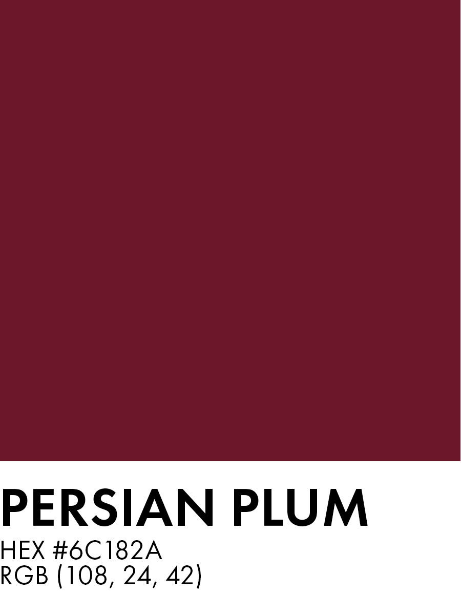
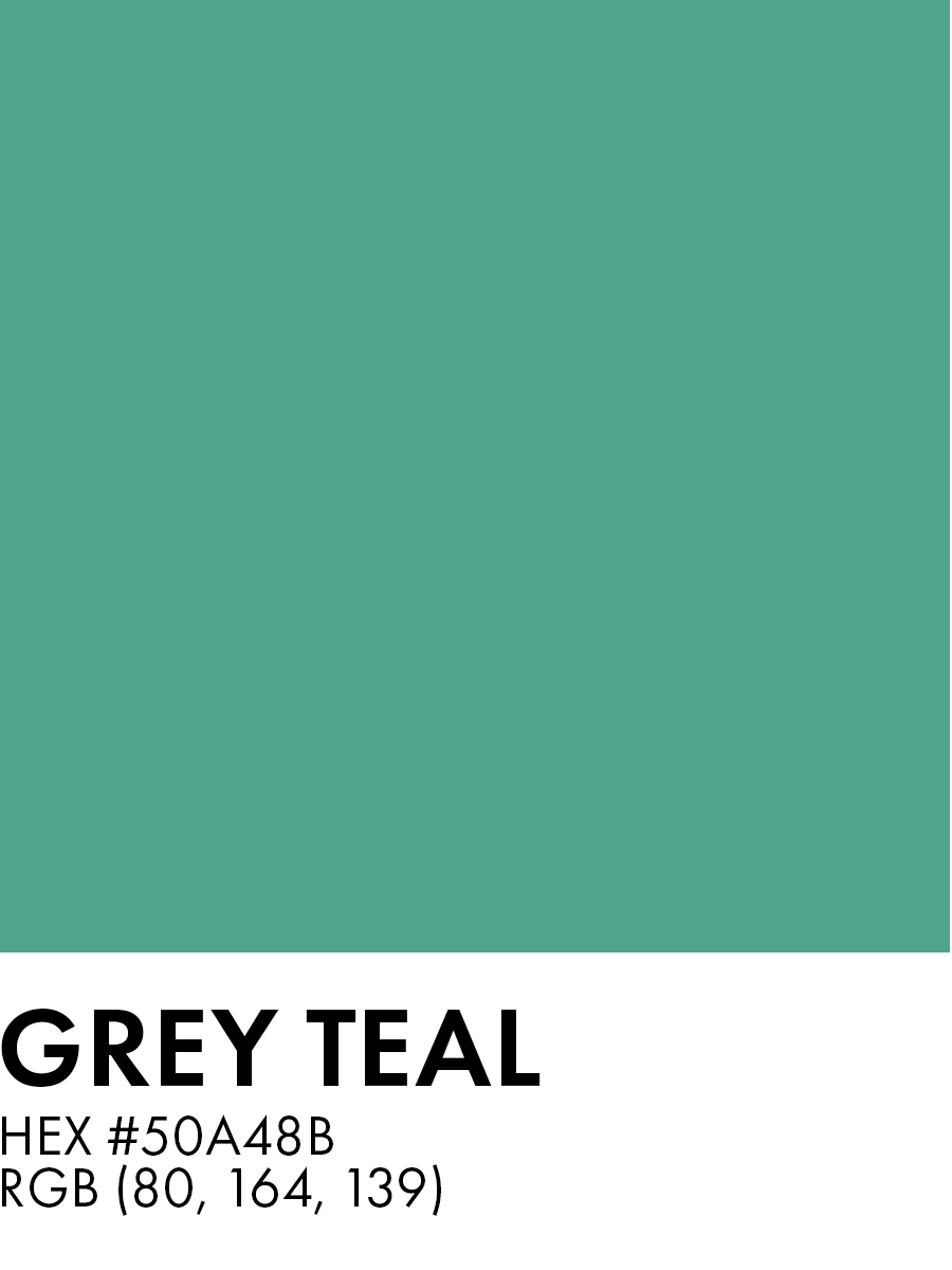
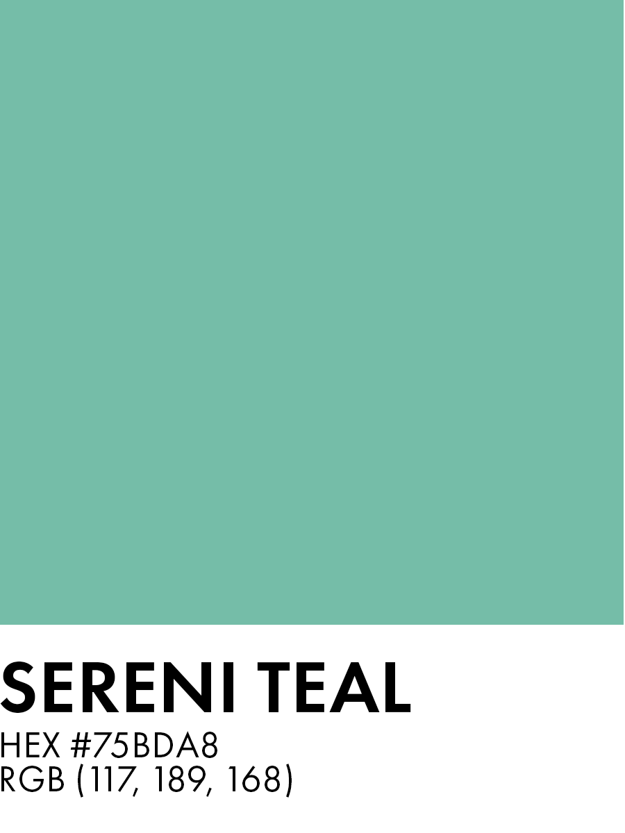
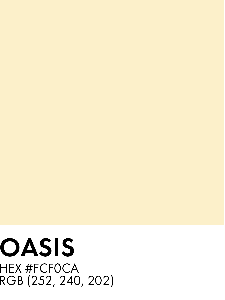
Our OD Kids color palette consists of earthy tones that are intentionally trail-themed, reminding us of our NextGen Trails theme. Our color palette includes shades of teal, plum, and yellow, which are perfect for creating a natural, outdoorsy feel. When designing for OD Kids, we want to use these colors to evoke a sense of adventure, exploration, and discovery, reflecting our desire to guide children on their own faith journeys.
While there are many colors to choose from, it is best to pick just 2-3 and stick with those throughout the design. This will create a cohesive and consistent look and feel that is easy on the eyes and enjoyable for parents and kids.

TYPOGRAPHY
Consistency is key in creating a strong brand identity for OD Kids. Therefore, it's important to use the correct typography. The OD Kids font family is Futura, which is the same font family used for the main Open Door brand. This helps to maintain consistency across all materials related to OD Kids, and also reinforces the connection between the two brands. When using typography for OD Kids, it's important to follow the same guidelines as the main brand, including font size and weight. This will ensure that all materials are cohesive and recognizable as part of the Open Door Church family.
Futura is a geometric sans-serif typeface that has been widely used in various design applications, including print, web, and branding. Designed in 1927 by Paul Renner, the font features clean, simple lines and a modernist, timeless look. Futura is an excellent choice for titles, headings, and body text, as it is highly legible and has excellent readability. It comes in several weights and styles, from light to bold and condensed to extended, providing flexibility in design choices. When using Futura, it is essential to consider spacing and alignment, as its geometric shapes can create visual imbalances if not used carefully. The Open Door Church style guide recommends using Futura for its modern, clean, and versatile design, creating a cohesive and professional look across all communication materials.
When using the Futura font family for OD Kids, it's important to create hierarchy and visual interest with font weights and sizes. Use the regular or book weight for body text and a medium or heavy weight for headers. Use the condensed and extra bold typefaces sparingly. In addition, make sure to vary font sizes to distinguish between different levels of information. For example, use a larger font size for section headers and a smaller font size for subheadings, body text, or captions.
FUTURA
The five boxing wizards jump quickly
Aa Bb Cc
The five boxing wizards jump quickly
Aa Bb Cc
The five boxing wizards jump quickly
Aa Bb Cc
LOGO
The OD Kids logo is a distinctive circular badge with a forest scene in the center, which reflects the NextGen Trail theme of the ministry. The logo features three colors: plum, teal, and yellow, which work together to create a playful and inviting vibe. The use of bold and thick lines in the design creates a clear and memorable visual identity for OD Kids. Use the logo in its original colors and form, without any modifications or distortions, to maintain consistency and clarity in branding. Additionally, it is important to provide adequate space around the logo and avoid overlapping it with other design elements to ensure that it remains legible and recognizable. To ensure consistency and clarity, please adhere to the following guidelines when using the Open Door logo:
- Maintain ample space around the logo so it is not cluttered
- Always maintain the correct proportions of the logo
- Never stretch, distort, or alter the logo in any way.
- Never convert the logo to greyscale as OD Kids print materials should always be full-color
- When using a color as a background, try to use Orangy Yellow as shown below if possible.
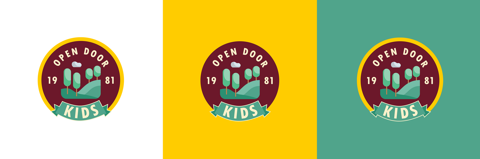
PHOTO USAGE
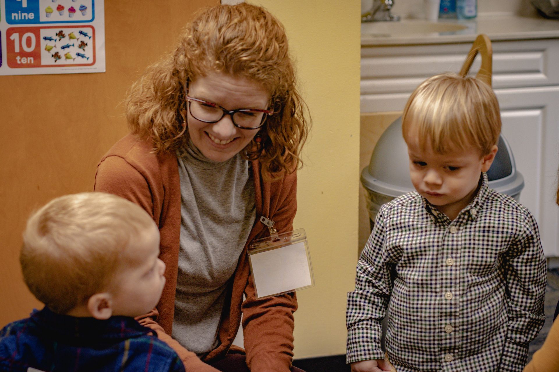
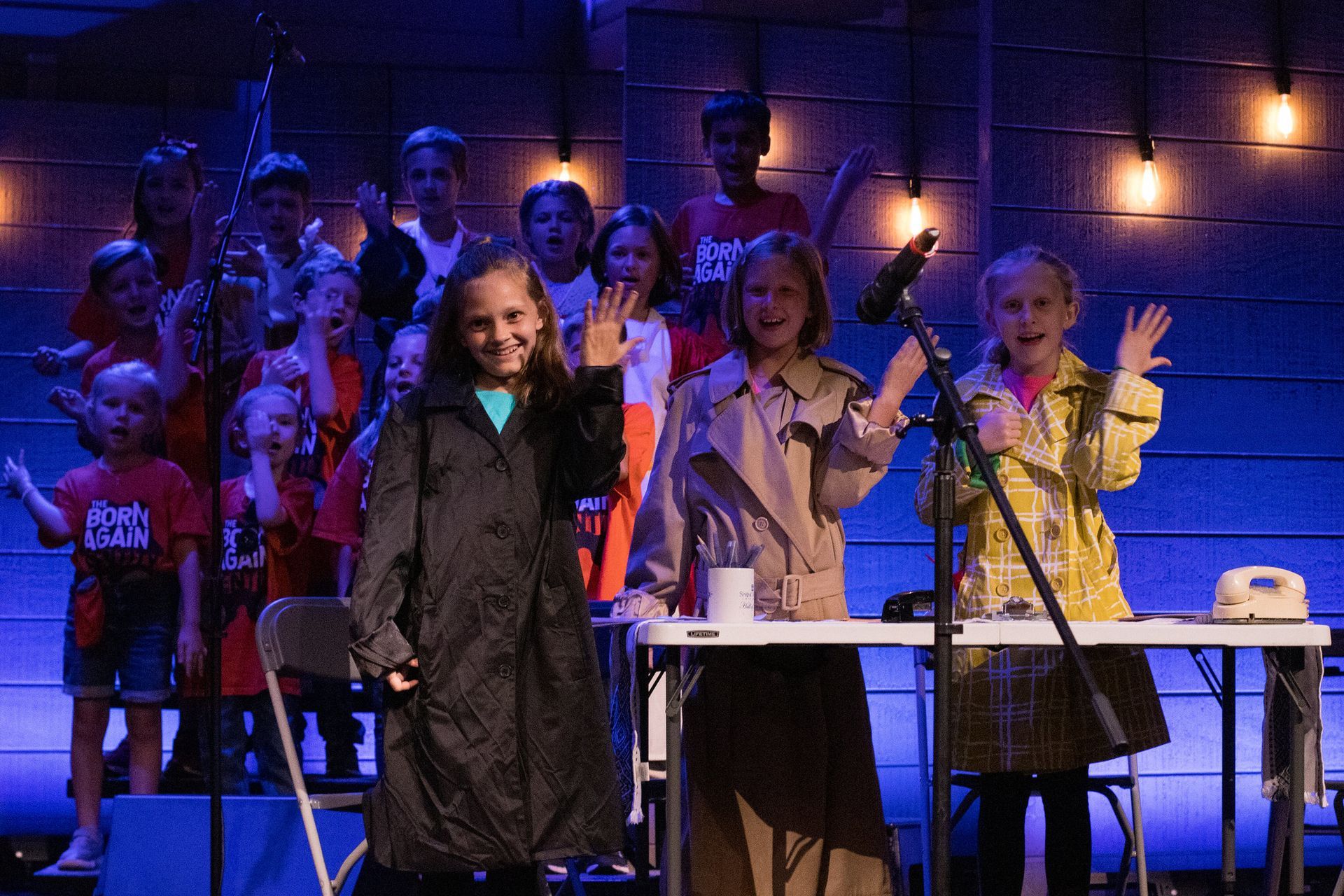
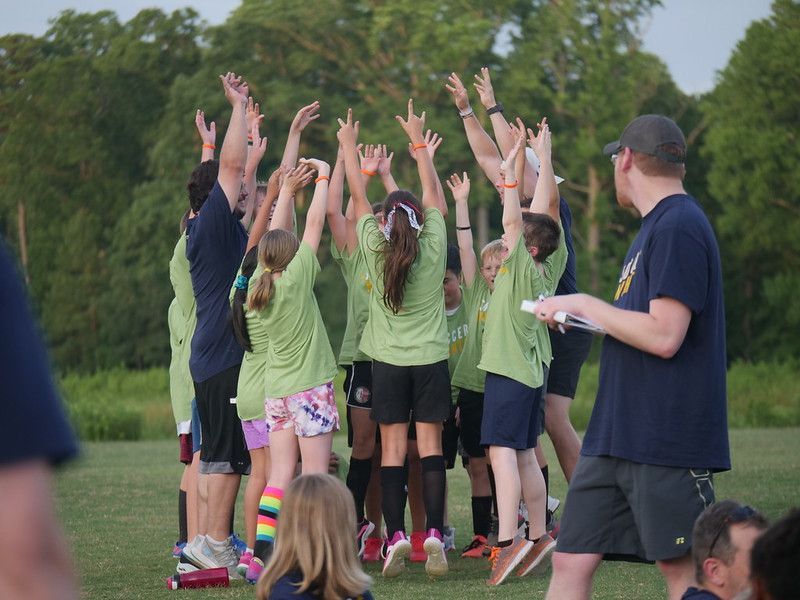
OD Kids is a fun, energetic, and safe environment where children can learn and grow in their faith. When using photos in OD Kids materials, it's important to reflect this atmosphere. Photos should be bright, colorful, and feature children engaged in activities or interacting with one another. Avoid using photos that appear posed or overly staged. Additionally, be mindful of including children of diverse backgrounds and abilities to ensure inclusivity. Finally, always obtain permission from parents or guardians before using photos of children in any OD Kids materials.
OPEN DOOR STUDENTS
BRANDING & STYLE GUIDE
Coming soon!
OPEN DOOR COLLEGE
BRANDING & STYLE GUIDE
Coming soon!